What are 10 tips for successful presentations?

This is the third and final chapter about Presentations. To complete this reader, read each chapter carefully and then unlock and complete our materials to check your understanding.
– Focus on the context of assessed academic presentations
– Introduce ten tips for successful presentation delivery
– Link the reader to other useful resources for assisting success
Chapter 3
In this final introductory chapter about completing presentations as a type of academic assignment, we discuss the ten most useful pieces of advice for improving your final performance. Please note, however, that if you require more specific detail about the topics of body language, delivery, presentation language and using visual aids, then Academic Marker has numerous short readers on this subject in our presentation skills section to help your studies.
Tip 1: Practice Sufficiently
One of the most important tips for success when delivering any type of presentation is to make sure that you’ve practised that presentation many times before the day of the performance. One of the most worrying things that can happen to a presenter during a presentation is that they forget something quite obviously in front of their audience. While this is bound to happen to everyone at some point, the more practice you have delivering your content, the less likely this is to happen to you.

By practising sufficiently before the day of your presentation and by designing a visual aid that reminds you of your talk’s structure and content, your memory should be better supported and the likelihood of you forgetting something important decreased. When practising, however, it’s important that you don’t memorise every word of your presentation or you could end up sounding too rehearsed. Instead of memorising your content word-for-word, instead know your presentation well, settle on some key phrases, and try recording yourself presenting out loud so that you can watch that presentation again and spot areas for improvement.
Tip 2: Use Notes and a Clicker
Another tip when presenting is to use notes to assist your memory and a clicker to improve the transitions in your visual aids. While a presenter can of course use handheld notes if they wish, a PowerPoint presentation can act as digital notes at the same time as displaying your content – and a clicker will allow you to transition between slides with ease. While it’s certainly a good idea to use notes to remind yourself of the content of your presentation, students should avoid reading from notes or slides directly as this will indicate to the audience that you haven’t sufficiently rehearsed or do not fully know your topic. If you need to, instead simply pause, look at your notes, return your gaze to the audience and continue speaking.
Tip 3: Proofread Your PowerPoint Slides
Precision, accuracy and consistency are all important academic skills, particularly when creating and delivering assessed presentations. If your PowerPoint slides are not only free of typos, spelling errors and grammatical mistakes but are also free of any inconsistencies within your argumentation, then your audience will likely be better persuaded by, and engaged with, your ideas. An academic presentation that includes inaccurate facts, dates or statistics, or that has clearly misinterpreted a theory or subject-specific term is unlikely to be well received. Likewise, poorly aligned text boxes and images are not going to impress your assessor either. Make sure that you thoroughly proofread your presentation before practising it out loud, and maybe even consider sharing that document with friends, family members or peers so that they can spot any errors too. While a perfectly edited presentation won’t necessarily be a successful one, it is more likely to impress.
Tip 4: Avoid Inappropriate Slides


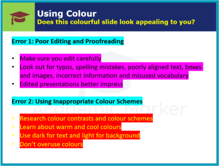
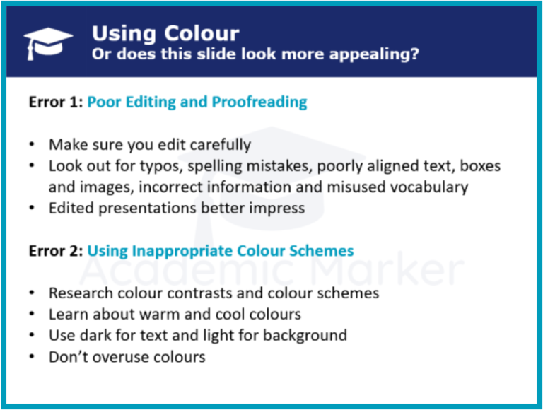
As can be seen in these images, another common error that students make when designing PowerPoint presentations is the inclusion of inappropriate aspects such as clashing colour schemes. Students should try to use darker colours for textual information and lighter colours as backgrounds, making sure that the text contrasts with the background so that it can be seen clearly. While colour can be used to emphasise a point, it’s never a good idea to distract the audience with its overuse.
Additionally, the inclusion of inconsistent fonts, slide designs and ever-changing transitions can also distract the audience. Create a smart and simple background and maintain it throughout your presentation, and decide on font sizes for different elements such as headings, subheadings and paragraphs and then stick with those sizes unfalteringly. And finally, while it might be tempting to include exciting sounds and animations within your presentation, it’s generally inadvisable to do so. Simple and consistent animations such as text that descends or appears upon entry is of course acceptable and advisable, but students should avoid using any animations that fly about the screen and inevitably distract the audience.
Tip 5: Memorise Language Models
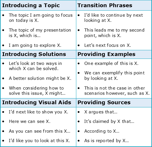
A successful presenter should also remember to include the specific language structures that work to signpost a presentation and that signal transitions and new sections. Examples have been provided for you below:

Tip 6: Face the Audience
A fairly obvious rule that many young presenters manage to get wrong is that the speaker should face their audience at all times, using a cautious but confident amount of eye contact to directly engage everyone watching. If the audience cannot see the front of the presenter, then aspects such as pronunciation, clarity, body language and facial expression may all be lost – negatively affecting the overall performance (and potentially also your grade).
Tip 7: Avoid Looking at the Screen
Additionally, students have a tendency to turn to face the screen and PowerPoint presentation when presenting, creating the same problem as mentioned in Tip 6. If you have a PowerPoint presentation and you wish to gesture to your slides, then don’t turn your back on your audience; instead, make sure to maintain an open but side-on stance so that you’re mostly facing your audience while also turning slightly towards your visual aid.
Tip 8: Control Your Facial Expressions
We all make facial expressions without even thinking about it, but learning to control them, exaggerate them, and match them to the content of our presentation can be somewhat more challenging – particularly for new presenters. Smile as a general rule, especially when beginning and ending your presentation, but save the more serious facial expressions for the content of your talk when you may wish to communicate that careful attention is required.
Tip 9: Consider Your Posture
Posture, which is the overall stance of your body, is quite strongly linked with a person’s emotions. Boredom, anger, confidence – these are all noticeable from the way a person sits or stands. From the presenter’s perspective, it’s generally a good idea to adopt a confident posture. A good stance might be to stand up straight and broaden your shoulders, putting your hands beside or behind you and opening your body up to your audience.

Do this and you should sound, feel and look more assured when delivering your presentation. By curving a back, reducing height, sinking into a chair or leaning onto a lectern or podium, the presenter may be demonstrating that they’re much too relaxed and are not taking their presentation seriously.
Tip 10: Avoid Fillers
Words such as ‘uh’ and ‘uhm’ are common fillers that should be avoided by presenters at all costs. It’s perfectly natural of course to use these words between phrases, clauses and sentences, particularly when you’re trying to remember the next part of your presentation. However, a presenter that has practised amply, and who has purposefully replaced their filler words with careful pauses, will sound much more precise and engaging to their audience.
Good work on completing our short reader on academic presentations. It might be a good idea to complete our Chapter 3 activities before continuing on with your academic studies.
To reference this reader:
Academic Marker (2022) Presentations. Available at: https://academicmarker.com/academic-guidance/assignments/presentations/ (Accessed: Date Month Year).
Downloadables
Once you’ve completed all three chapters in this short reader about Presentations, you might then wish to download our Chapter Worksheets to check your progress or print for your students. These professional PDF worksheets can be easily accessed for only a few Academic Marks.
Chapter 1 explores the topic: What are professional and academic presentations? Our Chapter 1 Worksheet (containing guidance, activities and answer keys) can be accessed here at the click of a button.
Chapter 2 explores the topic: What are the key elements of EAP presentations? Our Chapter 2 Worksheet (containing guidance, activities and answer keys) can be accessed here at the click of a button.
Chapter 3 explores the topic: What are 10 tips for successful presentations? Our Chapter 3 Worksheet (containing guidance, activities and answer keys) can be accessed here at the click of a button.
To save yourself 2 Marks, click on the button below to gain unlimited access to all of our Presentations Chapter Worksheets. This All-in-1 Pack includes every chapter, activity and answer key related this topic in one handy and professional PDF.
Collect Academic Marks
-
100 Marks for joining
-
25 Marks for daily e-learning
-
100-200 for feedback/testimonials
-
100-500 for referring your colleages/friends