Which presentation methods are ineffective?

This is the third and final chapter about Using Visual Aids. To complete this reader, read each chapter carefully and then unlock and complete our materials to check your understanding.
– Provide seven errors for creating ineffective PowerPoint presentations
– Use examples and slides to clarify these errors for the reader
– Introduce the concept of body language, delivery strategies and presentation language
Before you begin reading...
-
video and audio texts
-
knowledge checks and quizzes
-
skills practices, tasks and assignments
Chapter 3
Welcome back to our short reader on using visual aids. Having now introduced what visual aids are, why they’re important, and which seven rules are most vital to the successful creation of an academic presentation, this third and final chapter next focuses on the seven most common errors that students make when designing their PowerPoint slides. Even if the presentation you’re creating is for a business meeting or job interview and is not academic in nature, many of the following mistakes are still relevant (and worth avoiding) in all digital presentations.
Error 1: Poor Editing and Proofreading
A PowerPoint presentation that has typos, spelling mistakes, poorly aligned text boxes and images, incorrect information or misused vocabulary is not going to impress your potential employer, your tutor or the attendants at a conference. Make sure that you thoroughly edit and proofread your presentation before practising it out loud, and maybe even consider sharing that document with friends, family members or peers so that they can spot any errors too. While a perfectly edited presentation won’t necessarily be a successful one, it is more likely to impress.
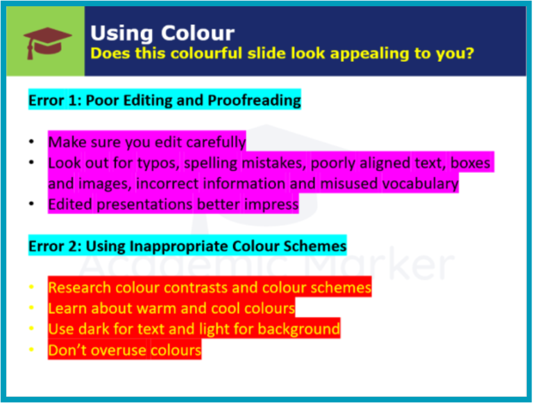
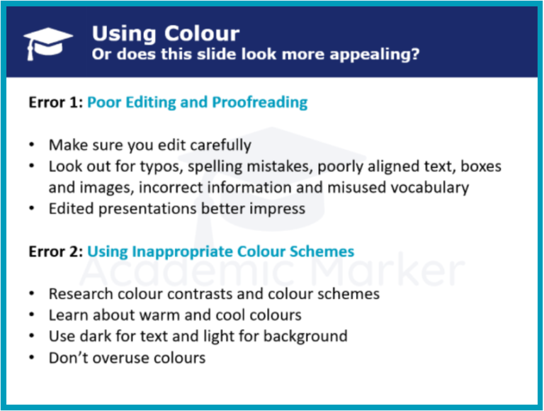
Error 2: Using Inappropriate Colour Schemes
Another common error that students make when designing PowerPoint presentations is by including inappropriate colour schemes. Consider doing some research into cool colours (blue, green), warm colours (orange, red) and how they interact. Try to use darker colours for textual information and lighter colours as backgrounds, making sure that the text contrasts with the background so that it can be seen clearly. While colour may certainly be used to emphasise a point, as can be seen in the examples below, it’s never a good idea to distract the audience with the overuse of colour:
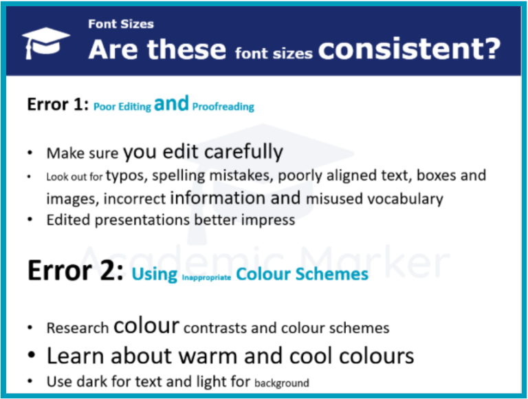
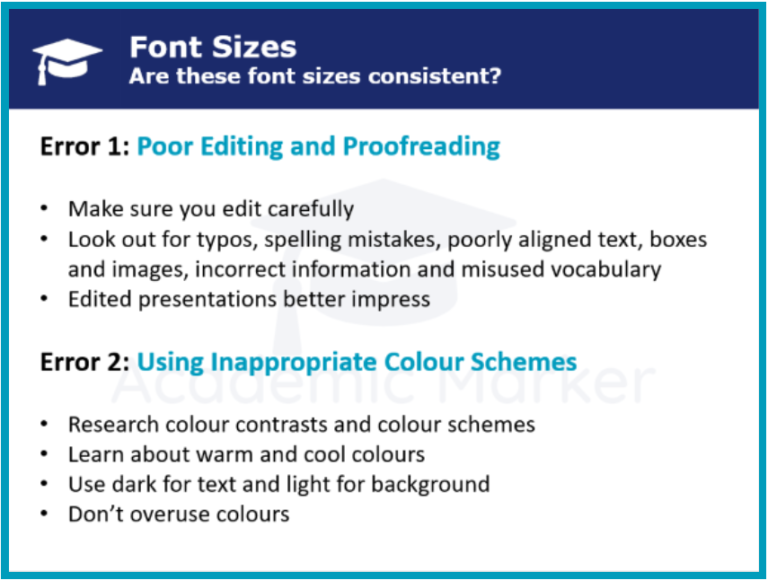
Error 3: Having Inconsistent Fonts/Styles
Likewise, the inclusion of inconsistent fonts, slide designs and ever-changing transitions can also distract the audience – which will likely mean that they’re not paying full attention to the content of your presentation. Create a smart and simple background and maintain it throughout your presentation, and decide on font sizes for different elements such as headings, subheadings and paragraphs and then stick with those sizes unfalteringly. As for which fonts are best, it’s generally recommended that sans-serif fonts such as ‘Arial’ are better than serif fonts such as ‘Times New Roman’ due to their improved resolution on larger screens:
Error 4: Crowding a Slide
In addition to making mistakes with the use of colours, fonts and formatting, students should also be careful not to crowd their PowerPoint slides – which means making sure that there aren’t too many words, pictures, animations or other elements on any one slide at one time. As was explained in Chapter 2, effective PowerPoint presentations are usually the ones that are concise and roomy, with the text on the slide never being identical to the presenter’s script.
Error 5: Overusing Sounds and Animations
While it might be tempting to include exciting sounds and animations within your presentation, it’s generally inadvisable to do so – especially tacky sound effects such as clapping or explosions. Simple and consistent animations such as text that descends or appears upon entry is of course acceptable and advisable, but students should avoid using any animations that fly about the screen and inevitably distract the audience. The same is true for transitions between slides, of which there are many over-the-top options embedded within the PowerPoint software that students should aim to avoid.
Error 6: Not Practising Sufficiently
The sixth error on our list might be an obvious one, but students often appear to have forgotten to do this. The saying ‘practice makes perfect’ really applies when presenting in front of an audience, and academic presentations in particular, especially assessed ones, will need to be as precise, confident and rehearsed as possible – not only to impress your audience, but to also reduce your nervousness.
Of course, the presenter should still appear natural in their speech, and so students should try not to memorise every word, but should allow themselves plenty of time to practice their gestures and body language, their positioning on stage, the order of their content and any difficult vocabulary– remembering also to consider the types of questions that might be asked at the end of their presentation. Ultimately, because many aspects require careful consideration, students may wish to take our short readers on body language and delivery strategies to improve these aspects to a confident level.
Error 7: Going Over the Time Limit
Finally, students should do their very best not to overrun their time limit. In an assessed academic presentation, the presenter may be stopped short by the assessor as soon as they’ve gone over their allotted time. In such scenarios, students won’t be able to conclude their presentation, which could certainly cost them valuable marks. While you may not be stopped in a more general presentation by your audience, any presenter that goes considerably over the time limit will undoubtedly appear less prepared than they should be, weakening the strength of their arguments and limiting the efficacy of their presentation.
Now that you’ve completed all three chapters about using visual aids and building PowerPoint presentations in particular, you may next wish to study one of our other short readers about presentation skills. However, don’t forget also to unlock and complete our beginner, intermediate and advanced worksheets on this topic before moving on to check your progress and understanding.
Downloadables
Once you’ve completed all three chapters about using visual aids, you might also wish to download our beginner, intermediate and advanced worksheets to test your progress or print for your students. These professional PDF worksheets can be easily accessed for only a few Academic Marks.
Collect Academic Marks
-
100 Marks for joining
-
25 Marks for daily e-learning
-
100-200 for feedback/testimonials
-
100-500 for referring your colleages/friends